


First, we'll need an HTML skeleton. We'll use 2 groups of identical divs for the sides of the logo and one div for the head/body.
HTML Structure
  <body>
    <div id="discord-logo">
      <div class="group-left">
        <div class="wing-top"></div>
        <div class="wing-mid"></div>
        <div class="wing-bottom"></div>
        <div class="eye"></div>
      </div>
      <div class="group-right">
        <div class="wing-top"></div>
        <div class="wing-mid"></div>
        <div class="wing-bottom"></div>
        <div class="eye"></div>
      </div>
      <div class="head"></div>
    </div>
  </body>
CSS Styles
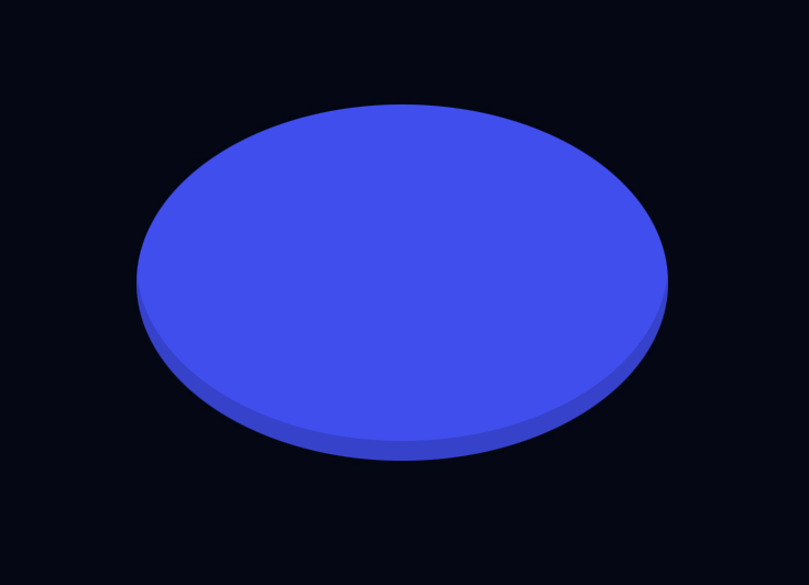
The CSS begins with styling the head as an oval with a drop shadow on the bottom:
body {
  position: relative;
  background: #040714;
  margin-top: 50px;
}

.head {
  position: relative;
  z-index: 5;
  width: 322px;
  height: 216px;
  top: 22px;
  left: 85px;
  background: #404eed;
  border-radius: 50%;
  box-shadow: inset 0 -12px 0 #00000026;
}
Then we'll add some shared styles for the other components:
.wing-top,
.wing-mid,
.wing-bottom,
.eye {
  position: absolute;
  background: #404eed;
  border-radius: 50%;
  z-index: 10;
}
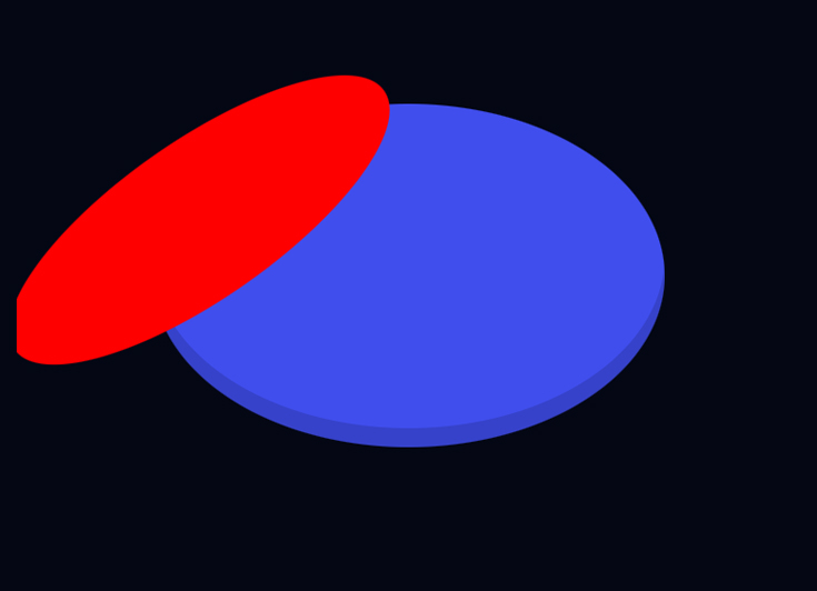
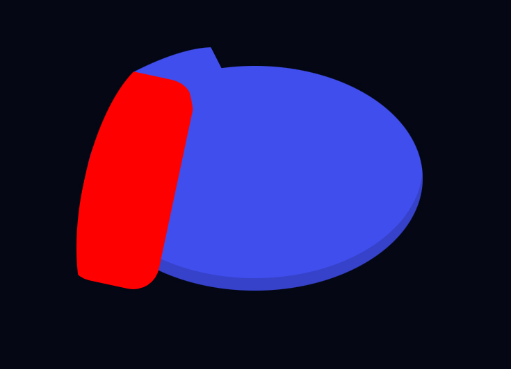
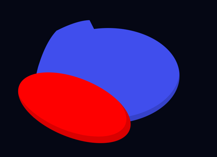
Next we'll start creating the left "wing." The top piece will be an oblong oval transformed and skewed:
.wing-top {
  height: 283px;
  width: 99px;
  top: -47px;
  left: 65px;
  transform: rotate(56deg) skewY(7deg);
  clip-path: inset(7% 0 61% 0 round 24px);
}
Once we apply that clip-path rule above, the shape will be cut away to look like this:
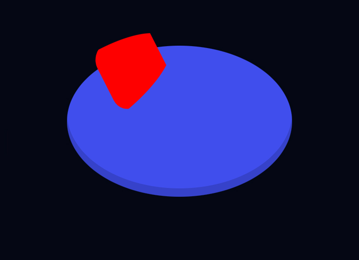
When we set the color of this shape to our bluish/purple then the overlap will blend in with the head/body. For the middle part of the wing, we'll add a similar shape then apply another clip-path rule:
.wing-mid {
  left: 81px;
  top: 12px;
  height: 263px;
  width: 101px;
  transform: rotate(12deg);
  clip-path: inset(7% 13% 15% 0 round 25px);
}
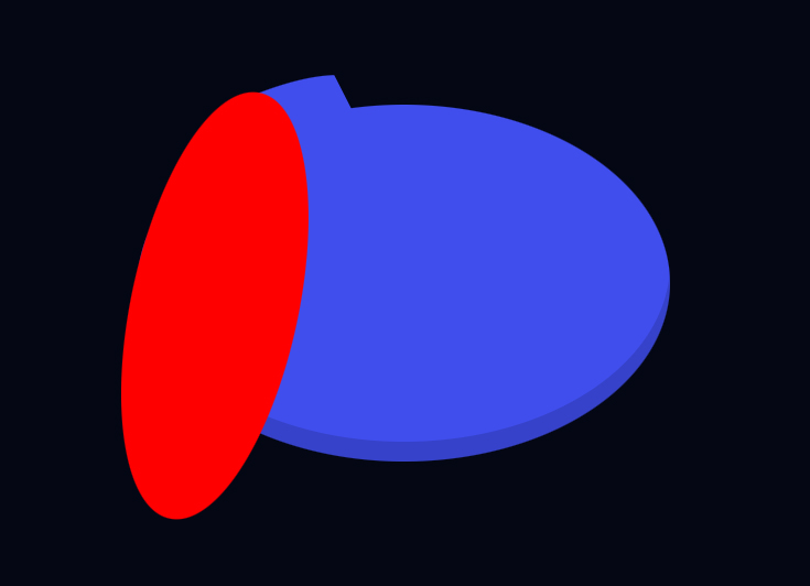
With the clip-path rule applied:
Then we'll add the bottom piece of the wing with this same procedure:
.wing-bottom {
  width: 309px;
  height: 116px;
  top: 144px;
  left: 15px;
  box-shadow: inset -14px -7px 0px 3px #00000026;
  transform: skewY(342deg) rotate(38deg);
  clip-path: inset(83px 118px 0 76px);
}
With clip-path applied:
Next we'll add a colored circle for the eye:
.eye {
  background: #040714;
  width: 61px;
  height: 70px;
  top: 116px;
  left: 159px;
}
Now all we need to do is reflect the .group-right element with an inverse scaleX:
.group-right {
  z-index: 10;
  position: absolute;
  left: 493px;
  top: 0;
  transform: scaleX(-1);
}
And we're done!
Here's the final code if you'd like to play around with it yourself: https://stackblitz.com/edit/web-platform-u1uzd3?file=index.html
Yo! I post byte-sized tips like these often. Follow me if you crave more! 🍿
I'm on TikTok, Twitter and I have a new debugging course dropping soon!