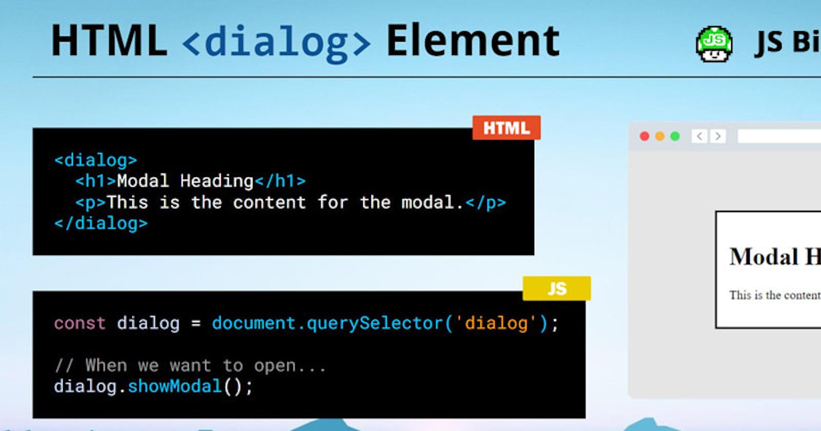
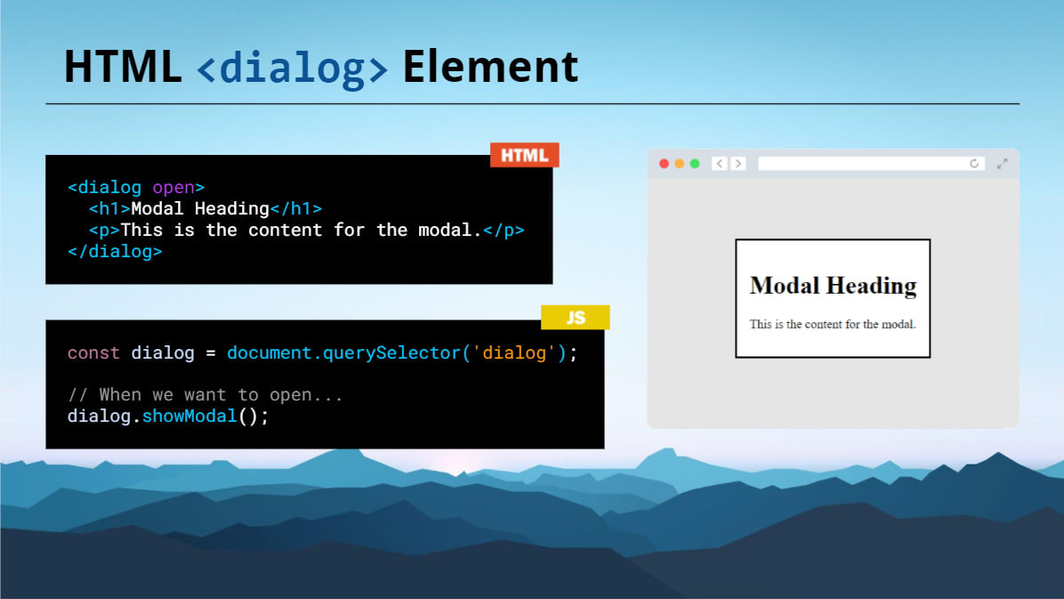
HTML's <dialog> element is a built-in tag to represent a dialog box or modal. It's not just a newer semantic element, it also includes an API and its own special CSS.
Here's a video using <dialog> in action:
How to use it
To start, we add our <dialog> HTML:
<dialog>
  <h1>Modal Heading</h1>
  <p>This is the content for the modal.</p>
</dialog>
This won't yet display any visible content, until we call the dialog's .showModal() method:
const dialog = document.querySelector('dialog');

// When we want to open...
dialog.showModal();
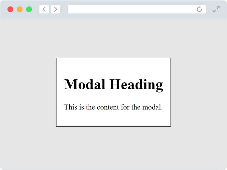
Calling this method will programmatically add the open attribute to the element, indicating its state and visibility:
<dialog open>
  <h1>Modal Heading</h1>
  <p>This is the content for the modal.</p>
</dialog>
It will also add a ::backdrop pseudo-element element with these default styles to dim the content behind the dialog:
dialog::backdrop {
  position: fixed;
  top: 0px;
  right: 0px;
  bottom: 0px;
  left: 0px;
  background: rgba(0, 0, 0, 0.1);
}
If we add a close button, we can hook up an event handler to call the built-in .close() method to un-show the dialog and remove the backdrop:
<dialog open>
  <h1>Modal Heading</h1>
  <p>This is the content for the modal.</p>
  <button id="close">Close</button>
</dialog>
const dialog = document.querySelector('dialog');
const btn = document.querySelector('#close');

btn.addEventListener('click', () => {
  dialog.close();
});

dialog.addEventListener('close', () => {
  // Runs after dialog is closed
  console.log('The modal was closed!');
});
The document also includes the close event which can be leverage to run a custom callback once .close() is called.
As of 11/21, support is available mainly for Edge, Chrome, and Safari Technology Preview with greater support emerging soon! 🙂
Yo! I post byte-sized tips like these often. Follow me if you crave more! 🍿
I'm on Twitter, TikTok and I have a new debugging course
